Redesigning their car companion app to include several new features and build out a new global design system for distributed design teams to access.
The current in market app had become bloated with added on features which meant navigating the app required too much cognitive load to the user. This had mainly come around because the app had not been run in the traditional sense of testing and iterating, so it was decided to set solid foundations by a complete overhaul of the app.
Role
Product Designer
Delivered
Native App
Services
Research, UX, UI, Prototype
Organising the IA
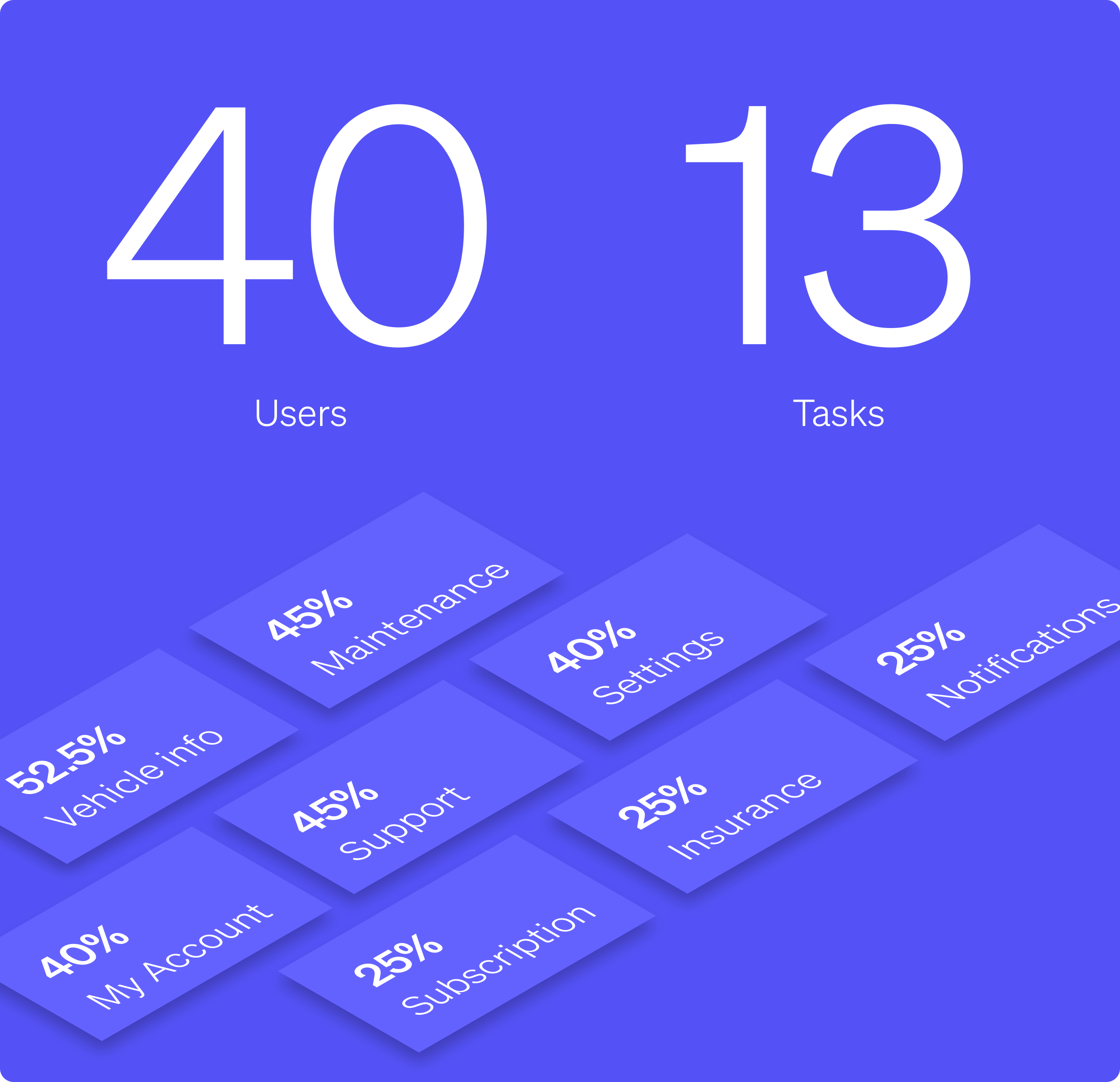
We took the in-market sitemap and flattened it out into sections, and then performed card sorting exercises with 40 participants that were car companion app users.
This allowed us to see general patterns in how users see where content should be placed within the app.
App function
Looking at the way the navigation was formed one pattern stood out, which was users were either wanting to perform actions on their vehicle, or they were doing some kind of admin. We defined these as:
Stationary
The user would need to view information on their vehicle.
Journey
A user is about to drive their vehicle and would use the app to control their vehicle.
Testing the navigation
Seeing as the card sorting exercise helped us identify 6 different main categories, we wanted to explore ways in which we could use layering to switch between states.
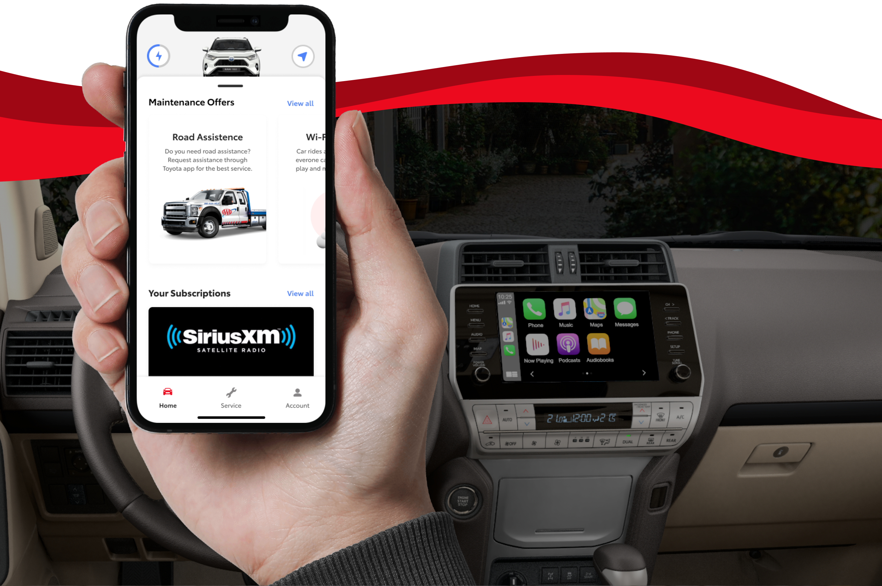
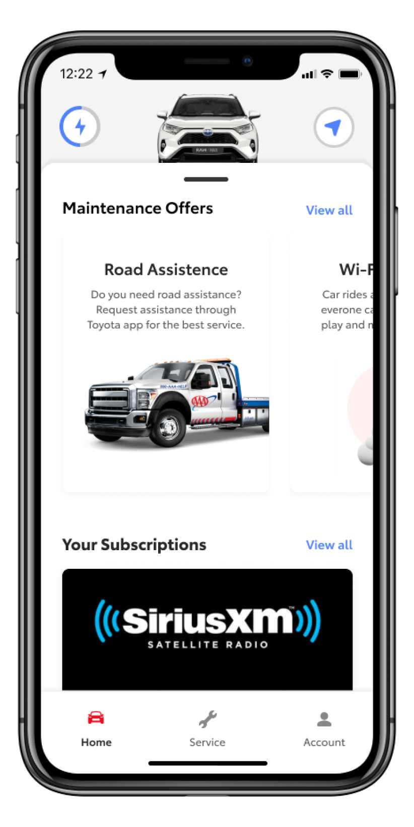
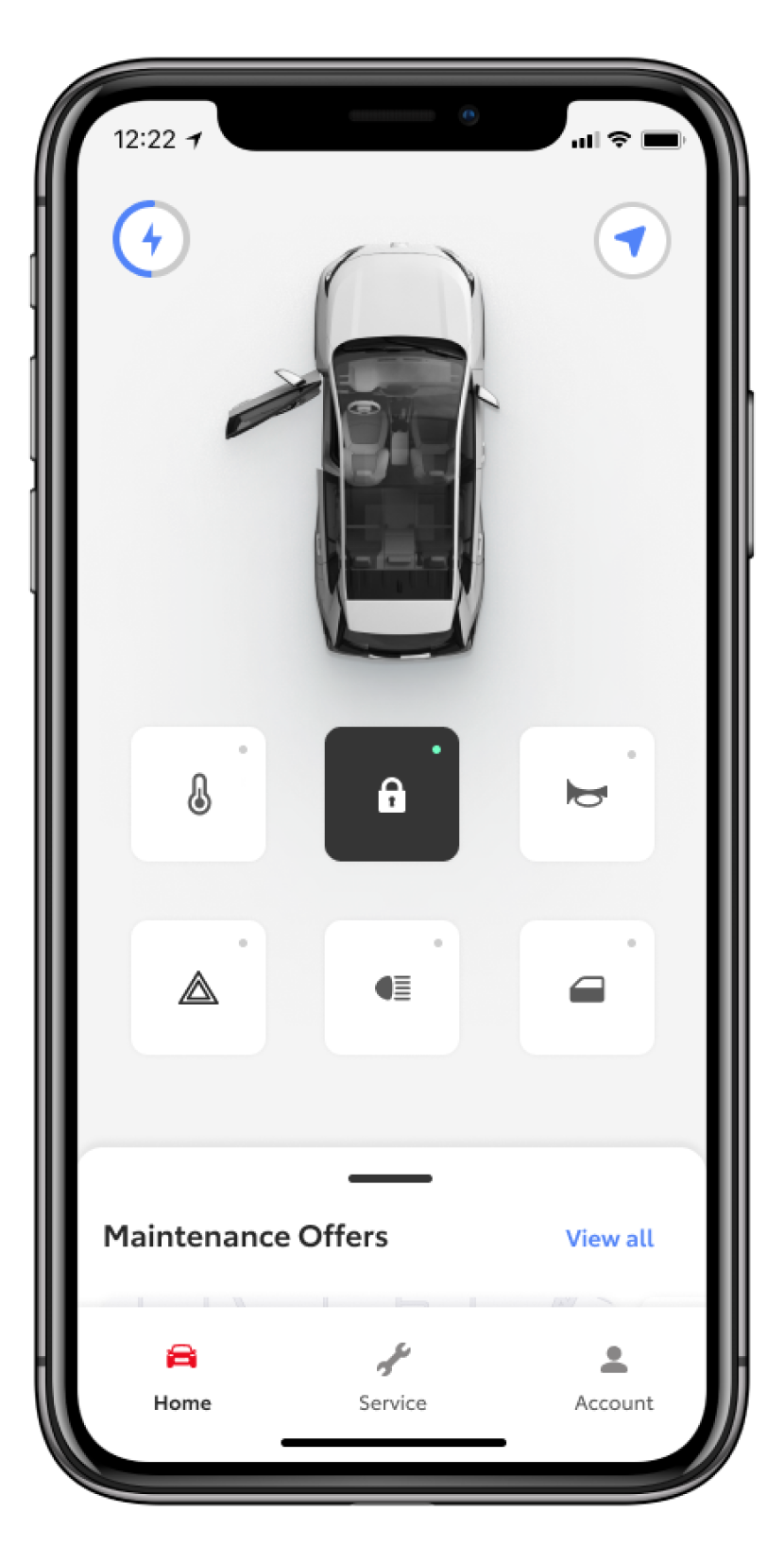
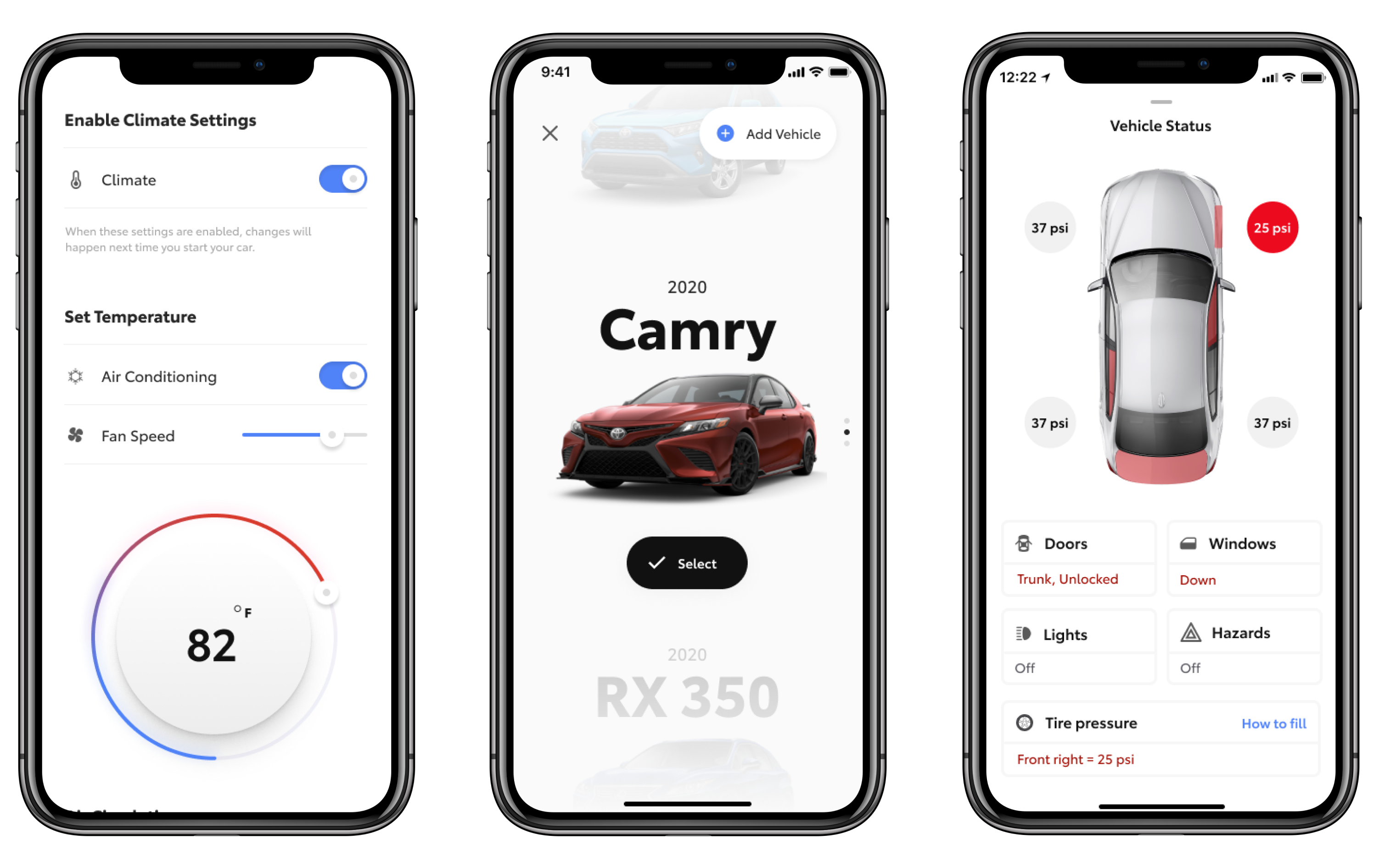
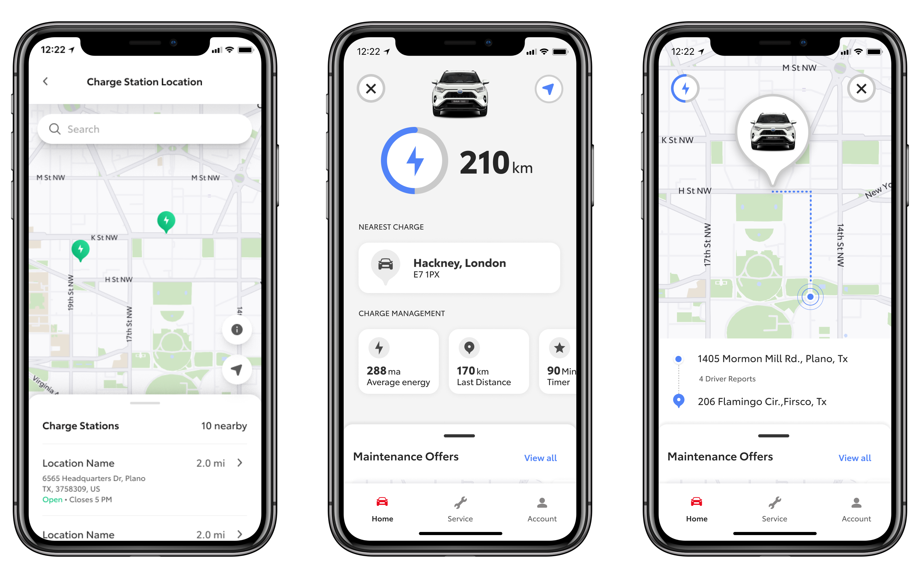
Essential Screens
As the app existed in market we needed to still include some of the essential features within the app.